Lending Association
Consultant to Lending Association a mortgage broking firm on their new mobile app, Feasy
Year
2022
Client
LA
Project Overview
My role in the Feasy project involved providing detailed UI/UX feedback on its Figma design to enhance user experience. This involved a thorough review of the design's appeal to its target demographic, its overall look and feel, colour schemes, and overall usability to ensure alignment with brand identity and user expectations.
I assessed visual appeal, accessibility, and consistency with the brand, proposing improvements to increase effectiveness and user engagement. The goal was to refine Feasy's interface to be intuitive and visually appealing, supporting a sophisticated product development strategy and ensuring a superior user experience.
Research
As the Lead UX & UI Designer, my goal was to: Minimise the stigma associated with taking loans against gold, Reinforce trust in Ruptok's brand, website, and services, Create a user-friendly website that enables users across India to apply for new gold loans or transfer existing ones, combining modern design with traditional elements.
The Task
Feasy is a mortgage broking app designed to enhance the mortgage broking experience. The task involved providing UI and UX feedback, highlighting specific areas responsible for the overall success of the mobile application.

Target Market Demographic.
Feasy caters to a diverse Australian audience, providing mortgage broking services to individuals across all ages, genders, occupations, education levels, incomes, and races, ensuring broad inclusivity.
This is a vital step in ensuring that the app’s design effectively addresses the needs of its varied user base. I made sure that the app considered the full spectrum of target market demographics before finalizing the design.

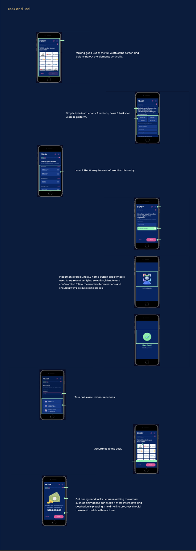
Look and Feel
I had to remember that while aesthetics are important, they shouldn't overshadow the app's usability and functionality. Striking a balance between visual appeal and ease of use was essential for Feasy's success. Therefore, the app is crafted to be both intuitive and inviting, combining contemporary design with user-friendly features to ensure a seamless and engaging experience
Colour Schemes
Colors play a crucial role in guiding user attention, evoking emotions, and establishing a consistent brand identity. Selecting the right colour scheme is essential, as it can attract or repel users and impact their engagement.
For Feasy, a mortgage broking app, choosing colours involved extensive research into competitors and user preferences. Colours like blue, which symbolizes trust and professionalism, were paired with pink and green to create a distinctive and appealing brand presence in the market.